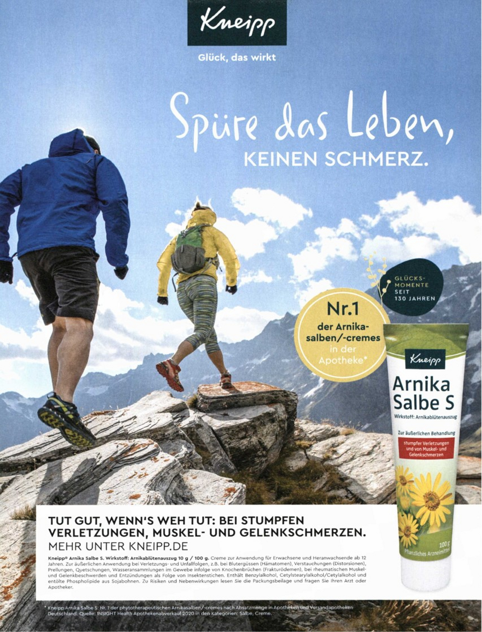
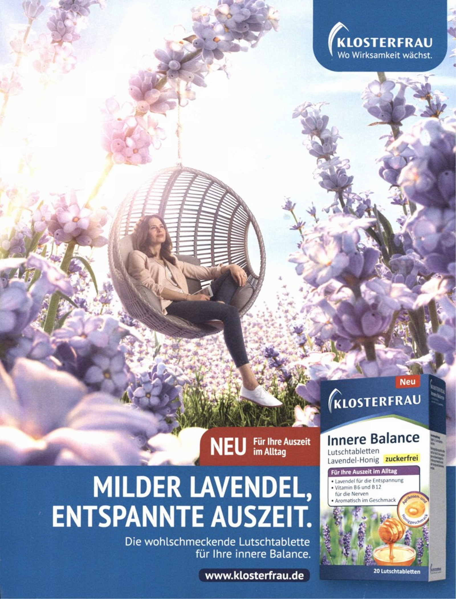
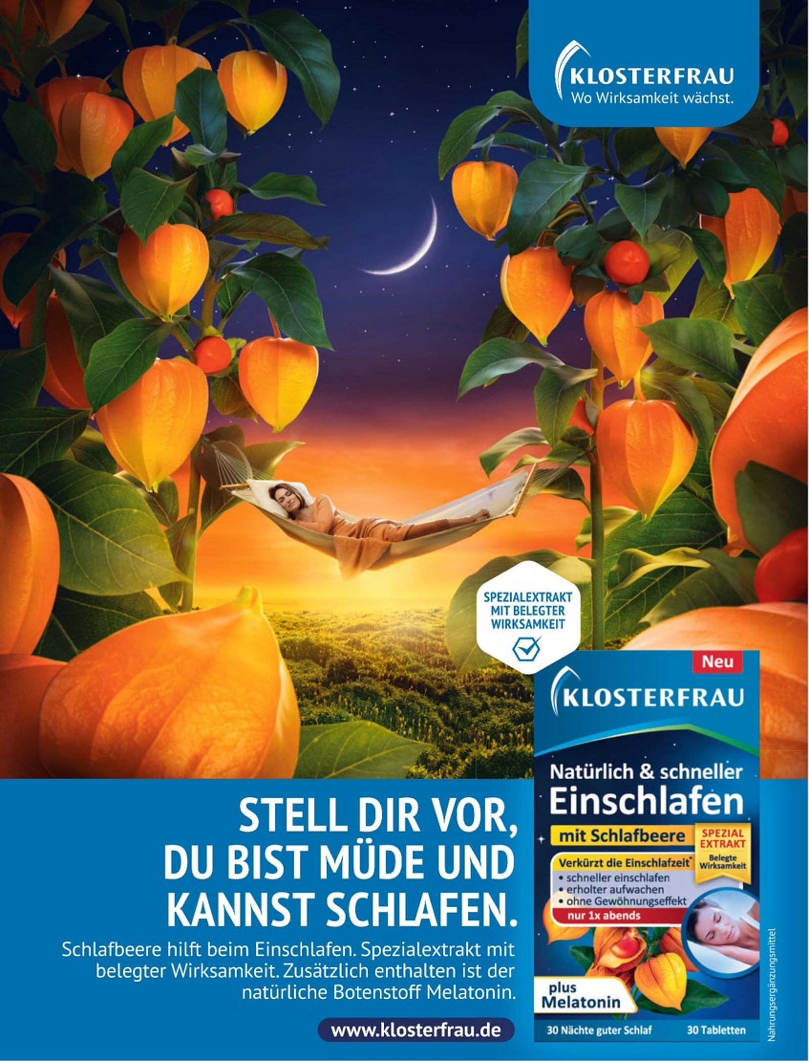
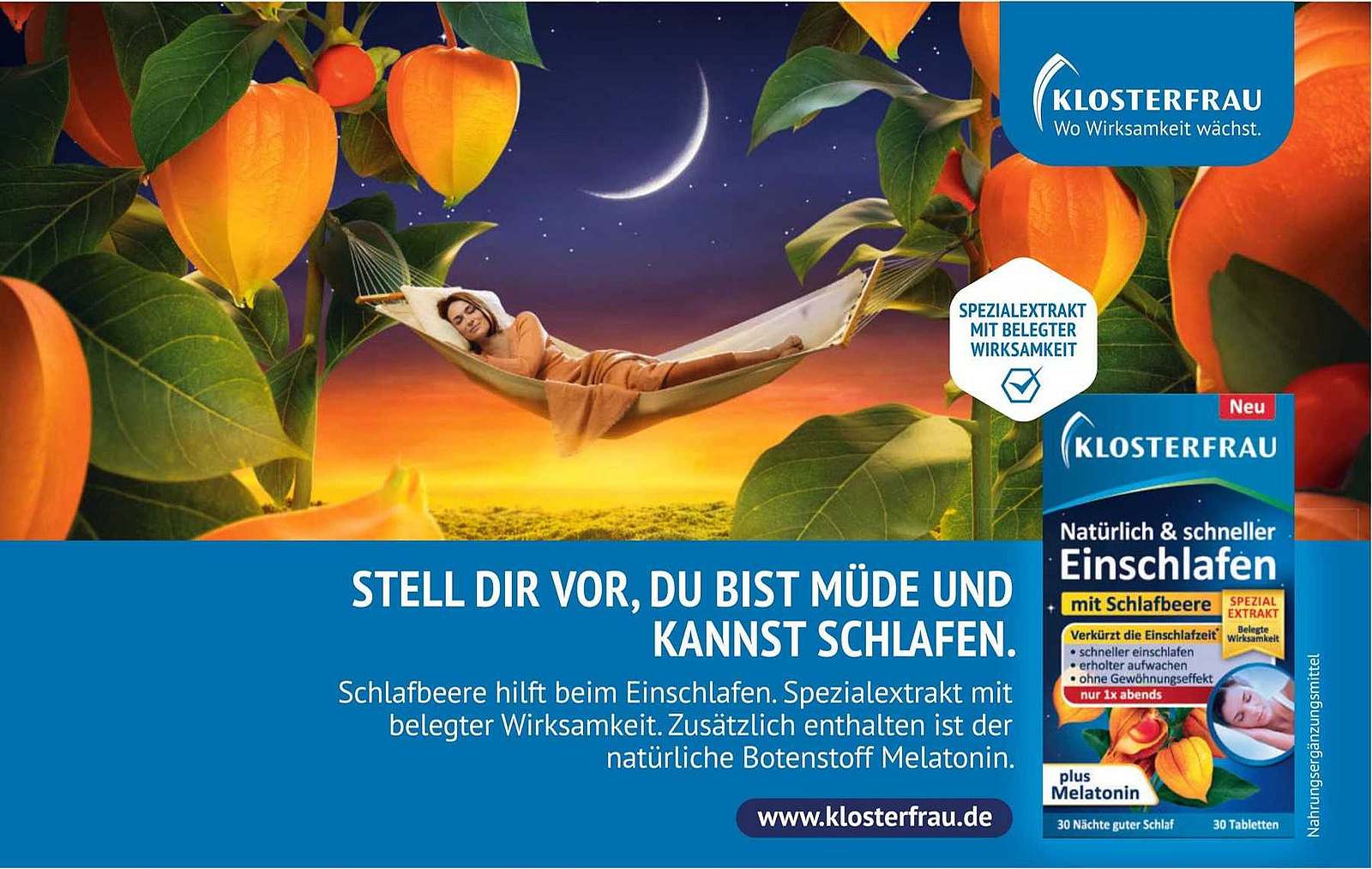
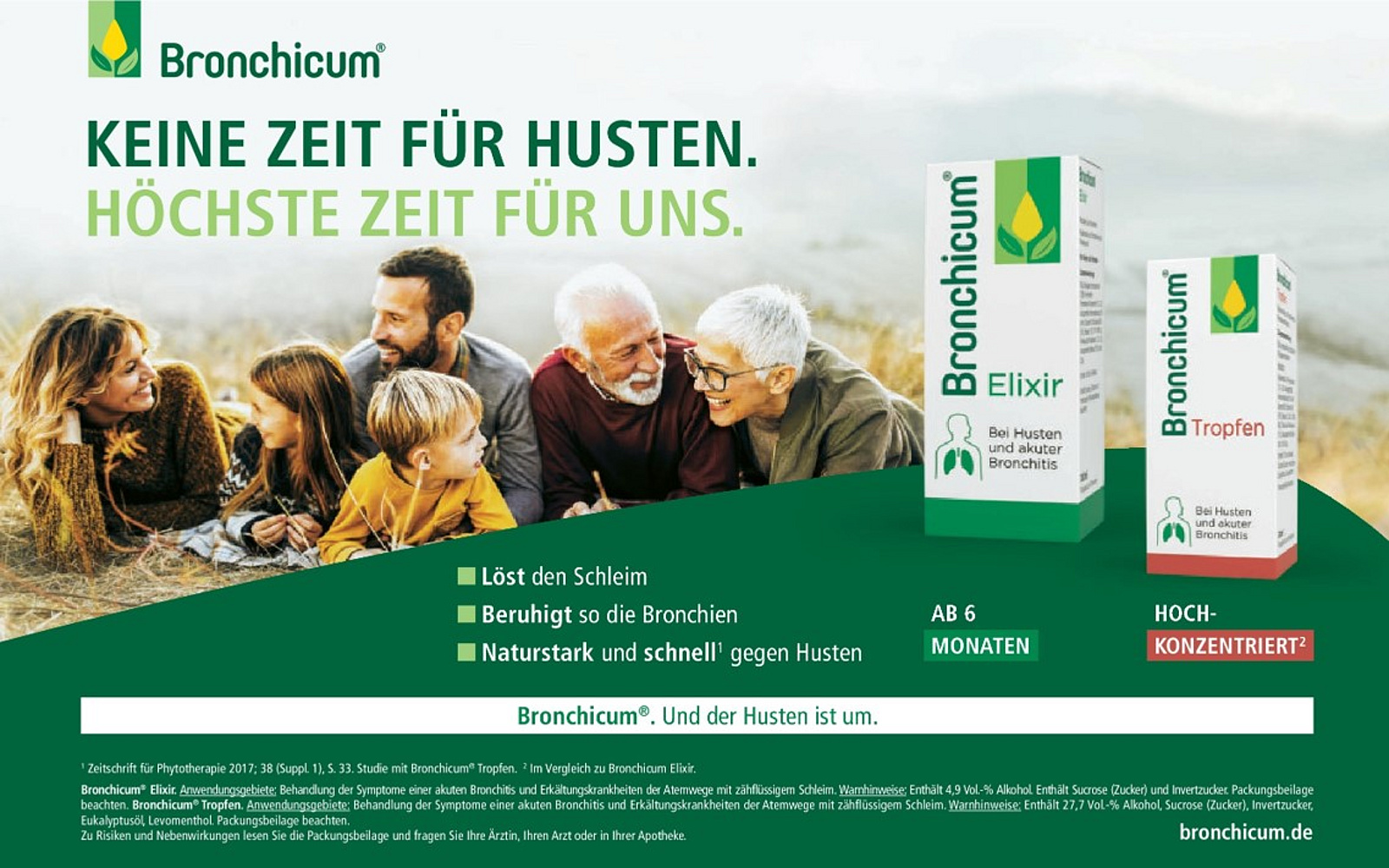
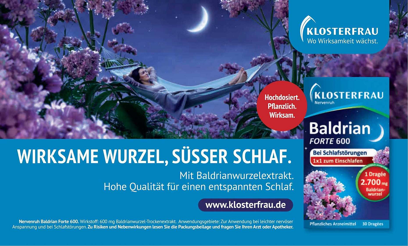
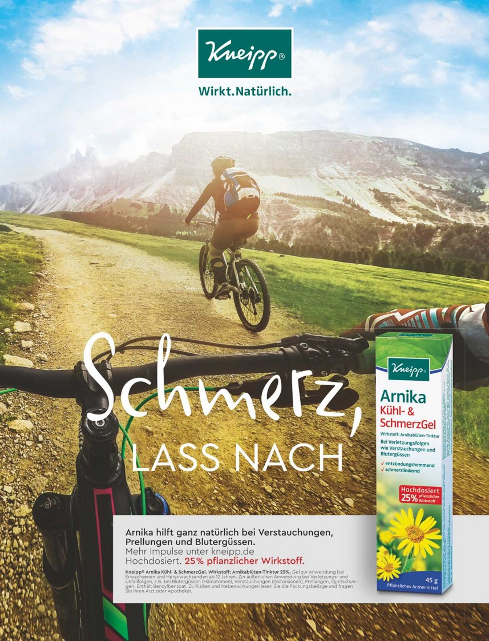
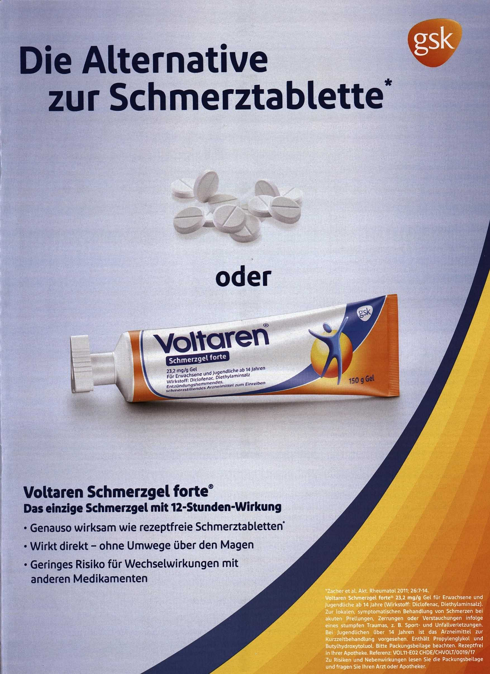
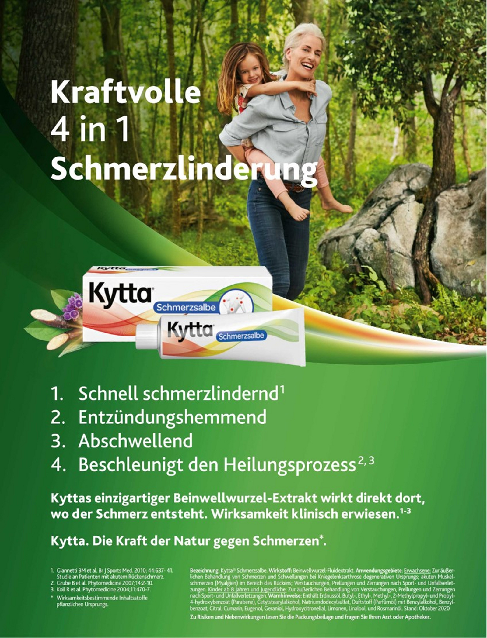
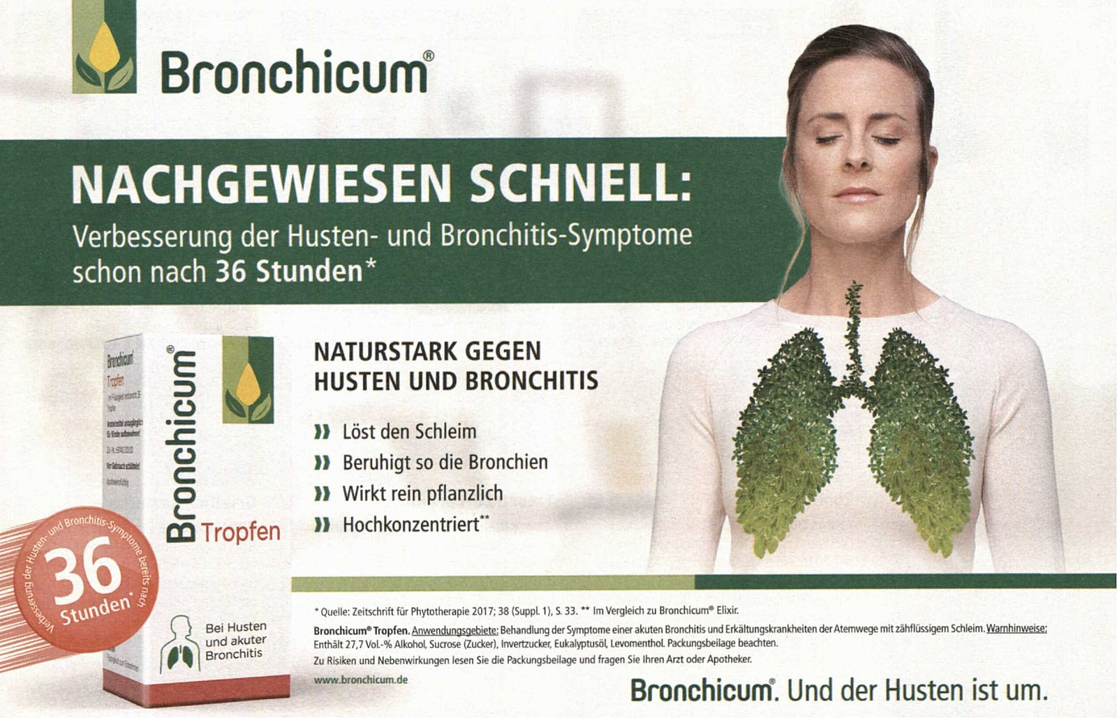
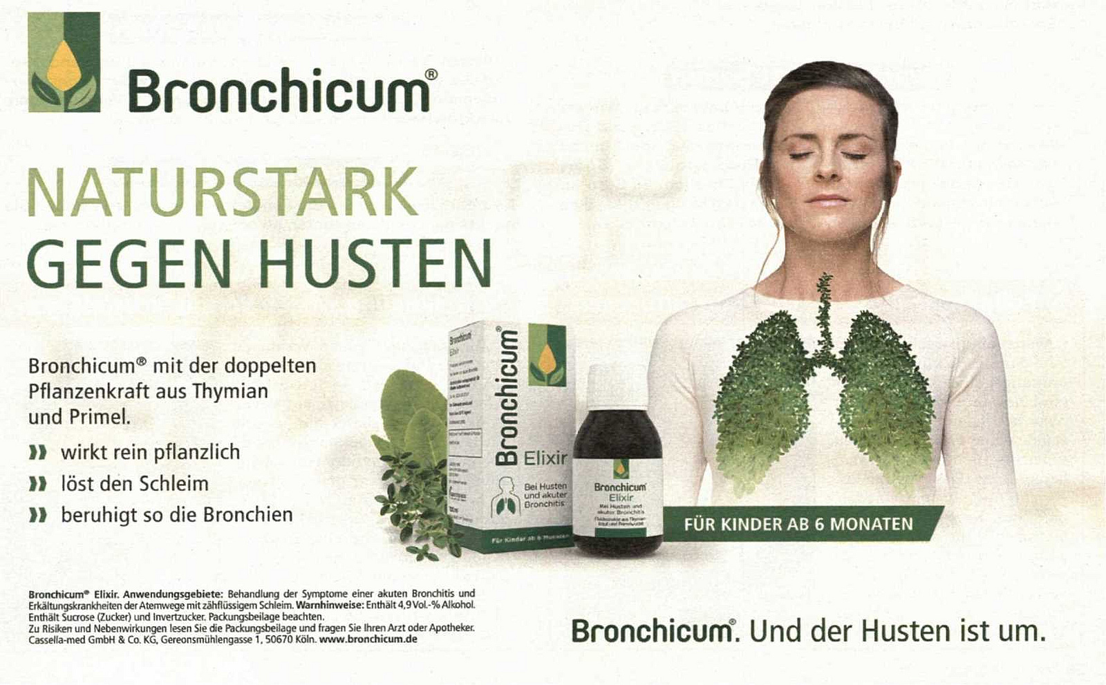
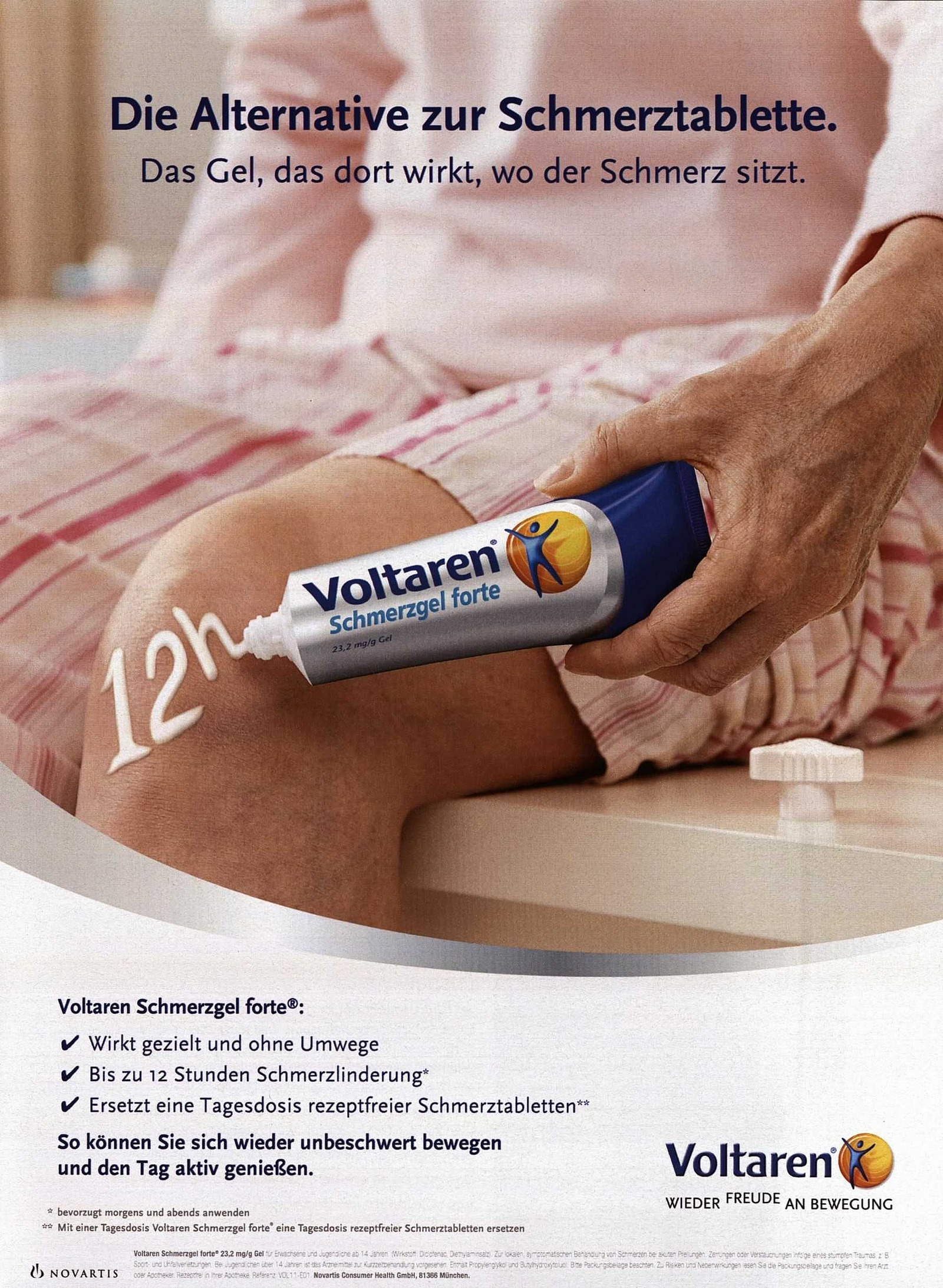
This is what a good pharma ad should look like!
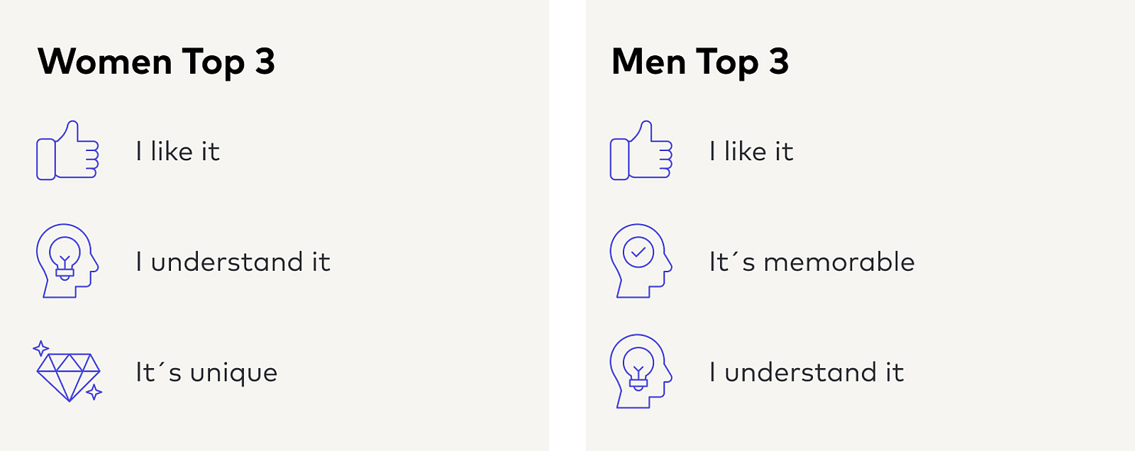
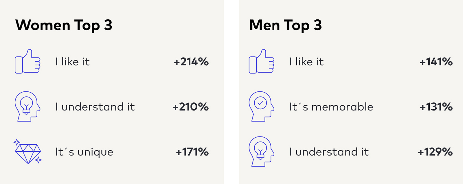
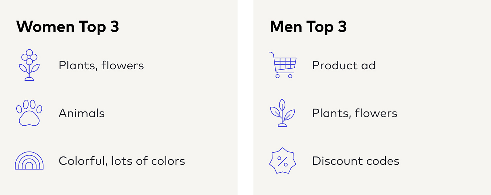
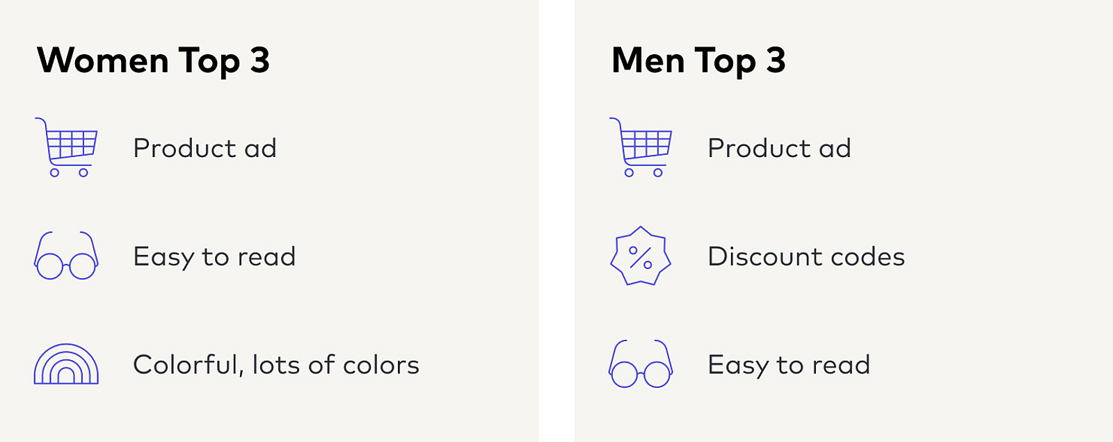
To identify the success factors of creative ads in the pharmaceutical sector, Media Market Insight (Burda’s market research unit) conducted the “b4t creative” study on behalf of BCN, comparing 926 motifs published between 2015 and 2024. The study surveyed a total of 14 parameters. In the look and feel of pharmaceutical ads, two design parameters were found to play a key role for both men and women: appeal (“I like it”) and comprehensibility (“I understand it”). These two parameters, in particular, increase the probability of entering the consumers’ relevant set.
Which other factors should advertisers consider when designing pharma ads? Read on to find out!
Which design elements decrease an ad’s “appeal”?
- Reminder coupons: Many people assume that this type of coupon contains a discount code. However, reminder coupons are only intended for presentation at the pharmacy. The added value for customers is minimal.
- Portraits of people: In the beauty sector, showing people is a way to increase advertising impact. In the pharmaceutical sector, however, it is often detrimental – e.g. when people are depicted in pain. This triggers a negative emotional reaction in the viewer.
- Website URL: Most people google a product. Hardly anyone would type a full website URL from an ad these days.
Which design elements decrease an ad’s “comprehensibility”?
- Celebrities: If the connection between celebrity and product is unclear, or if the celebrity is not well-known enough, this can impair the ad’s comprehensibility and appeal.
- Office, factory, company: Images of this type are less appealing because they trigger very little emotional response.
Behind the analysis: Testing creative work with b4t creative
According to the Advertising Research Foundation 75% of advertising impact is determined by the ad’s creative quality. But which ad motifs resonate with my target group? And which ones don’t? BCN clients can use “b4t creative” to test this.
Every month, this creative study examines 33 print and 7 online motifs – 400 people give their opinion on each motif. The print or online ads are tested in terms of appearance (for example: “eye-catching”, “credible”, “informative”) and activation. Examples of activation parameters: whether a product is purchased or whether it is in a buyer’s relevant set.
This study, which was based on “b4t creative” data, used lasso regressions to determine the drivers of the relevant set and the drivers of the key design parameters.
Get in touch with us!
Do you have any questions?

Tanja Seiter
Director Media Research at
Hubert Burda Media
tanja.seiter@burda.com
+49 89 9250 2849

